Very Pretty Very Peri Wins as Pantone’s Color of the Year for 2022
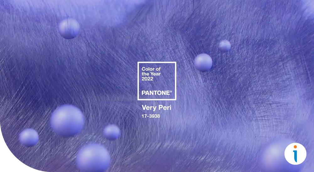
2022 is bringing in a courageous presence as Pantone has not only chosen but also created their new color, PANTONE 17-3938 Very Peri as it’s top pick for Color of the Year! It’s best described as having a presence that encourages personal inventiveness and creativity.
As we look to the future of next year Pantone has chosen Very Peri as it “displays a carefree confidence and a daring curiosity that animates our creative spirit”. This beautiful and royal color opens up a new way for brands to alter their marketing landscape with new possibilities.
It’s no secret we are living in a benchmark in history that has transformed so many lives. PANTONE 17-3938 Very Peri is “a symbol of the global zeitgeist of the moment and the transition we are going through”. As society continues to grow and emerge back into reality from isolation, Very Peri “illustrates the fusion of modern life and how color trends in the digital world are being manifested in the physical world and vice versa”.
“As we move into a world of unprecedented change, the selection of PANTONE 17-3938 Very Peri brings a novel perspective and vision of the trusted and beloved blue color family, encompassing the qualities of the blues, yet at the same time with its violet red undertone, PANTONE 17-3938 Very Peri displays a spritely, joyous attitude and dynamic presence that encourages courageous creativity and imaginative expressions.” – Leatrice Eiseman, Executive Director of the Pantone Color Institute
At Image Cube we utilize expressive colors to convey our clients’ brand message that not only attracts customers, but evokes the vision that our brand partners want to convey. Pantone’s Very Peri can be utilized within our print marketing products and services such as direct mail, window graphics, display signage, banners, and more! If you’re looking to brand your business with Image Cube, connect with our team to get started today!