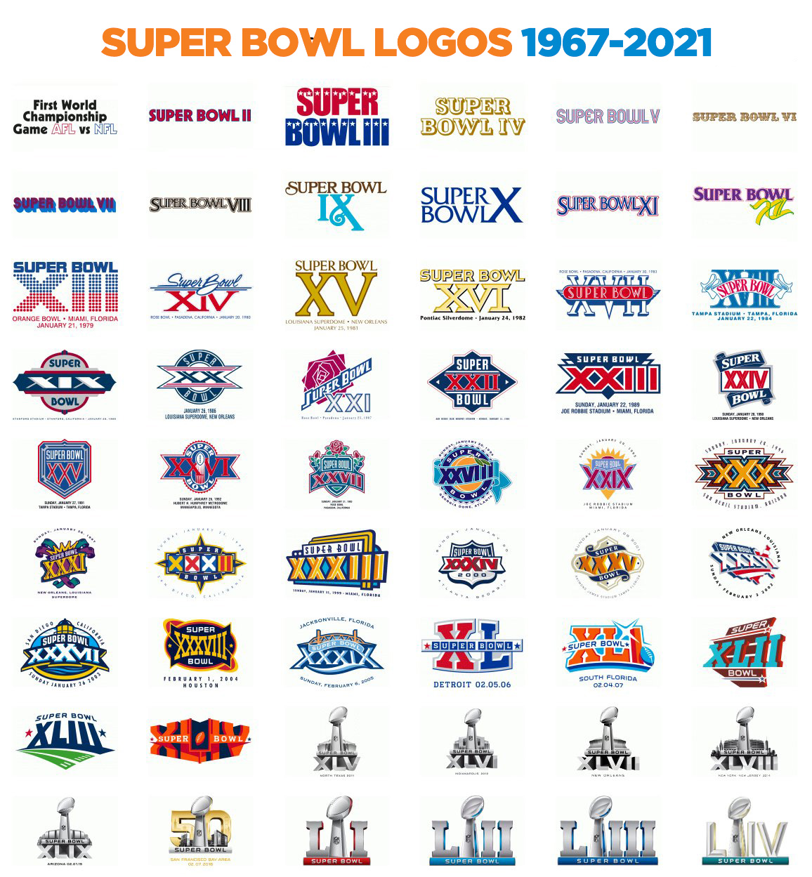
Top 5 Super Bowl Logos of All Time
LET’S GO! In just 4 days the Kansas City Chiefs will take on the Tampa Bay Buccaneers to vie for the NFL Super Bowl LV Championship! Naturally, we wanted to get in on the game by highlighting our top 5 Super Bowl logos of all time. So let’s kick it off….(pun(t) intended) and count them down!
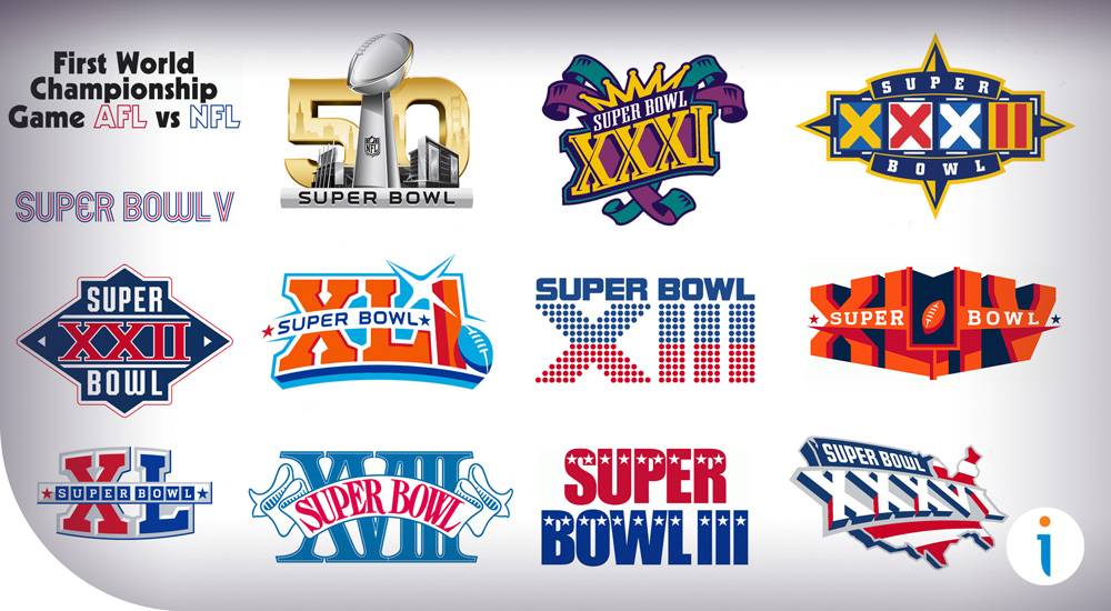
5. Super Bowl V
![]() First on the countdown comes from Super Bowl V in 1971. We love the nostalgia of the fifth Super Bowl when the Baltimore Colts defeated the Dallas Cowboys. The fun typace evokes the early 70s with neon billboards that gives it that classic hippy vibe and we dig it.
First on the countdown comes from Super Bowl V in 1971. We love the nostalgia of the fifth Super Bowl when the Baltimore Colts defeated the Dallas Cowboys. The fun typace evokes the early 70s with neon billboards that gives it that classic hippy vibe and we dig it.
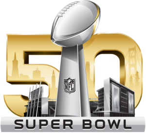
4. Super Bowl L
For the 50th anniversary of the Super Bowl, is when the logo took a real turn that was “game-changing” to say the least as the Denver Broncos crushed the Carolina Panthers. For the big 5-0, the logo transitioned from individually designed logos that were unique every year to the Vince Lombardi trophy that we’ve come to know the past six years. While some critics didn’t like it and thought it was a bit boring and sterile, we love the new look and prominent placing of the trophy. We also appreciate the detail of incorporating the city and stadi
um for extra depth.
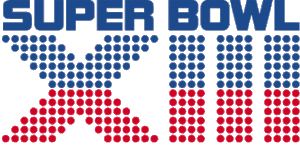
3. Super Bowl XIII
Anyone else getting a flashback of Space Invaders or PacMan video game vibes with the dots? Because, we are! For the 1979 Super Bowl logo, when the Pittsburgh Steelers defeated the Dallas Cowboys, it took us back to our gaming days with the dots evenly split to create two teams, while also representing the players on the field.
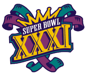
2. Super Bowl XXXI
This logo has us wanting to join the parade and toss some beads at Mardi Gras! We love that it utilizes that classic New Orleans purple and green as it’s a fresh look from the usual American colors from previous logos. As the Green Bay Packers defeated the New England Patriots with a fun game, we also love how the logo incorporates the fun and festive jester…the life of the party. After all it is just a game.
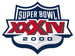
1. Super Bowl XXXIV
And the winner goes to the big Super Bowl logo that brung in the new millenium for 2000 when the St. Louis Rams conquered the Tennessee Titans. With the shield being the prominent display in the logo with the American red, white and blue, it reminds us that the USA loves football and unites together to celebrate the sport. The simple palette and fun typography keep it clean but still iconic. The shading also adds an appealing sense of dimension and depth that makes it the best Super Bowl logo of all ti
me.
So there you have it…our top 5 favorite Super Bowl logos from the past 55 years. We enjoyed looking through the changes and evolvement of the logos and are excited for the big game this Sunday! So now it’s your turn. Which logo is your top pick? Leave a comment below and let us know which is your favorite.